How to use our colors for data visualization
For Microsoft Office 365, we use a set of predefined base colors. These colors are typical for graphs and carefully selected to create maximum contrast between different values.
The main color scheme for graphs
For Microsoft Office 365, we use a set of predefined base colors, which are typically used for graphs. The colors provide a maximum contrast with each other.
Example
Sentiment and alert colors
The sentiment color scheme is used to indicate values ranging from positive to neutral to negative.
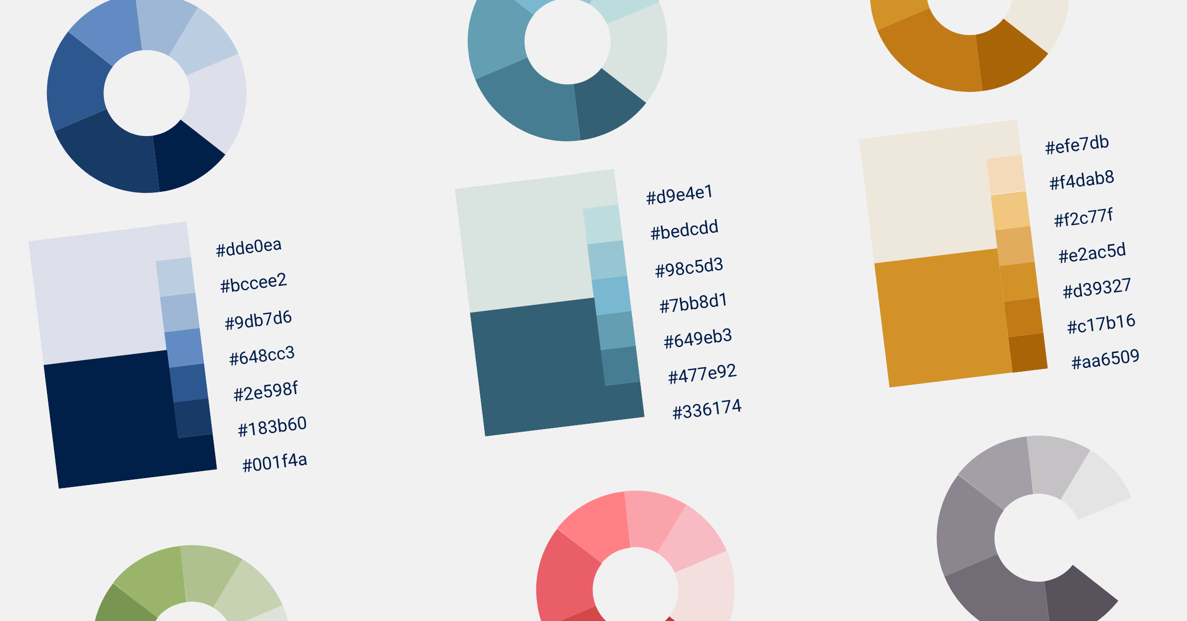
Color gradiants
In addition, our color scheme includes many shades of our base colors that are used in cases where more colors are needed.
Color gradients are used for figures and graphs. They consist of 6 colors, which are selected based on brand colors with the highest contrast.
Now you’re ready to rock with data visualization 🙂