How to play with our colors

| Chief Marketing Officer
1 min. reading time
Retriever's brand colors originate from our Nordic roots and reflect the colors of our Nordic landscapes, from sky and sea to sand and cliffs. Here you can read about how to put the entire color palette into practice.

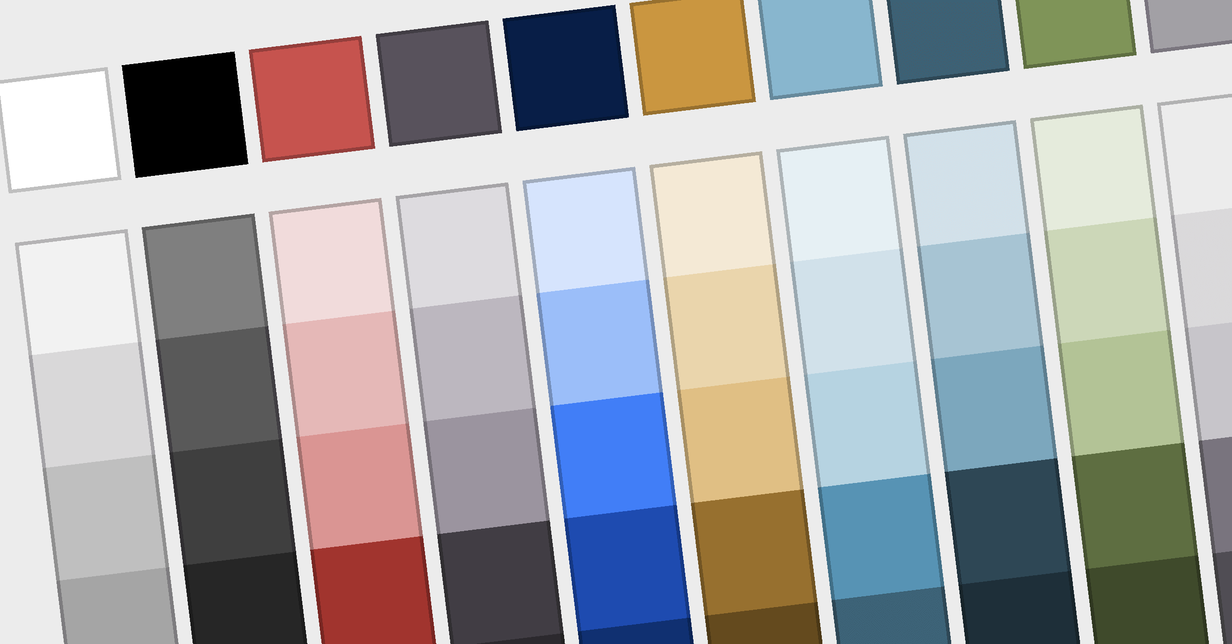
Which color for what?

If you find it difficult to know which colors to use for what, here are a few tips.

Light colors for backgrounds

light colors

The light colors are for backgrounds – for example, the background color of your PowerPoint slide.

📌 Tip
A good rule is not to mix many different background colors in your presentations. Choose one color for your presentation and stick to that. Otherwise, it may seem too colorful and overshadow your message.

Dark colors for contrast effects

dark colors

The dark colors are dark variants of the light colors and should not be used for backgrounds except the Retriever blue color. For example, use dark colors for labels, shapes, and icons. Just remember to use the correct dark color to match the light color you chose for your background.

Can I use other colors?

The short answer is: No.

Use only the colors in our color palette. The design guide provides more information about how to use our colors.

Read more

DOWNLOAD

Book en demo af vores medieovervågning

Book en demo af vores platform til social listening

Book en demo af
vores platform til social media management

Did you know?

You can download all our blog posts as PDF files and read them when you have time.

DOWNLOAD E-BOG

Barcelona-principperne 3.0

DOWNLOAD GUIDE

Guide til AI-drevet medieovervågning

DOWNLOAD medieanalyse

Medieomtalen af Folkemødet 2024

Medieovervågning
- vejen til indsigt

DOWNLOAD E-BOg

Fra medieomtale til markedsindsigt

DOWNLOAD guide

Download vores guide til Social Media Management

DOWNLOAD medieanalyse

Medieomtalen af Folkemødet 2024

TEMPLATE

Download template til din kommunikationsplan

Medieovervågning
- vejen til indsigt