New wizard makes analysis design conversion a breeze
Recently, I released a Wizard that helps you update the design of PowerPoint slides and Excel charts to align old Retriever analyses with our new brand identity.
The purpose is not to make reports 100% compliant with every detail of the new design (that would be impossible), but to quickly create the look and feel of the updated brand identity.
How it works
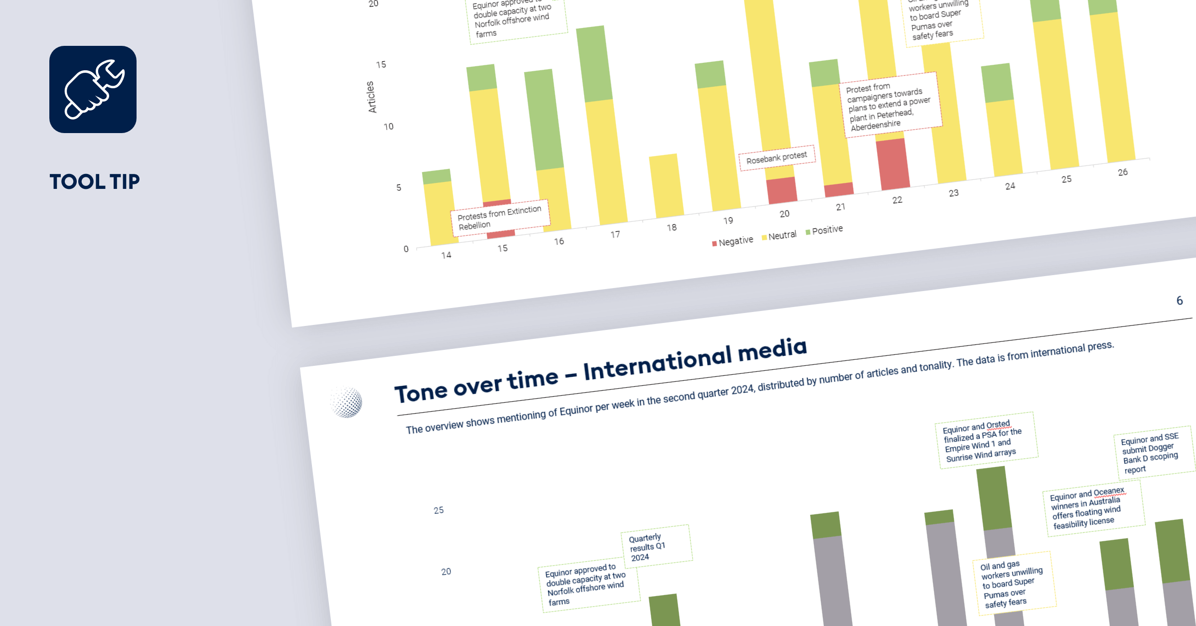
For PowerPoint, the function scans each slide and shape and adjusts fonts, colors, positions, logos, and more. It does not insert the full template or replace slides (except the front page), but imitates the style.
For Excel, it updates charts across the workbook in the same way.
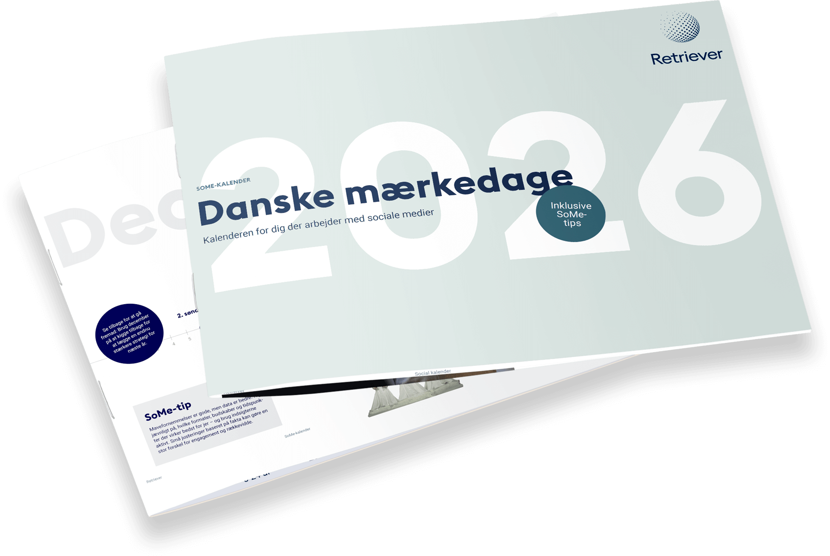
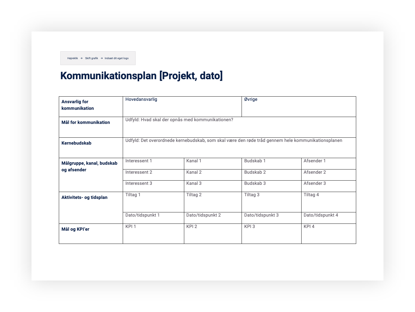
Before conversion

After conversion

How to use it
- Open the PPT presentation → click Update Active Presentation
- In Excel → click Update Charts in this Workbook

If you’re running an automated Wizard solution, apply these steps once to the files in your “Main folder” where reports are generated. If something looks off (e.g. misplaced logo, incorrect sentiment colors), just reach out to me — I can tweak the function to improve it.
Please reach out if you need assistance.
Read more